SCAN2VERI
SCAN2VERI IS A BLOCKCHAIN-POWERED DOCUMENT VERIFICATION PLATFORM THAT ENABLES FINANCIAL INSTITUTIONS, GOVERNMENT AGENCIES, AND CORPORATIONS TO REGISTER, STORE, AND VERIFY THE AUTHENTICITY OF SCANNED DOCUMENTS. THE ECOSYSTEM CONSISTS OF AN ADMIN DASHBOARD FOR INSTITUTIONS AND A MOBILE APP FOR END-USERS TO STORE AND PRESENT THEIR VERIFIED DOCUMENTS. AS A SOLO DESIGNER, I CREATED THE ENTIRE PRODUCT FROM SCRATCH — INCLUDING A COMPREHENSIVE DESIGN SYSTEM, COMPLEX DATA MANAGEMENT INTERFACES, AND MULTI-ROLE ACCESS CONTROLS.
THE CHALLENGE
THE PAIN
Document fraud costs businesses and governments billions annually. Traditional verification methods are slow, unreliable, and easily compromised. Financial institutions and government bodies needed a secure, blockchain-based solution that could:
- Register and store verified document scans from multiple branches
- Allow instant authenticity verification when documents are presented
- Manage complex hierarchies of users, branches, and permissions across different countries
- Provide a seamless experience for both institutional users and end-clients
THE SOLUTION
This wasn't just another dashboard — it was a multi-stakeholder ecosystem with:
- 3 distinct user roles (accountants, managers, system admins) with different access levels
- Multi-branch, multi-country architecture (Great Britain, Spain, Cyprus, Ukraine)
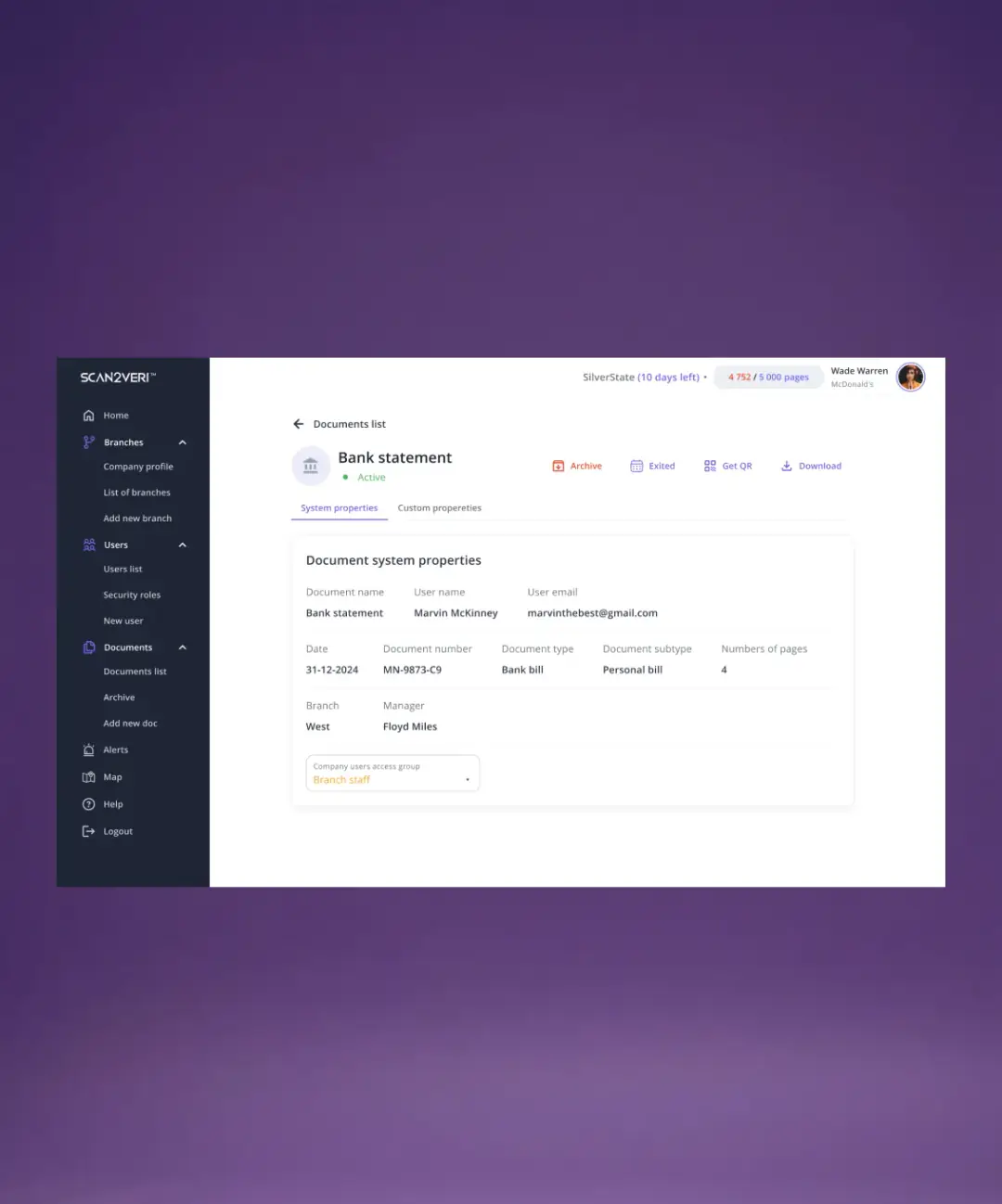
- Complex data relationships between companies, branches, users, and documents
- Blockchain integration requiring clear visualization of immutable data
- ~50 unique screens covering everything from user management to document verification
INFORMATION ARCHITECTURE & UX STRATEGY
THE PAIN
With multiple user roles, complex permissions, and hierarchical data structures (Company → Branches → Users → Documents), the risk of creating a confusing, overwhelming interface was high. Users needed to quickly navigate between different levels of the system without getting lost.
THE SOLUTION
I designed a clear, hierarchical information architecture with:
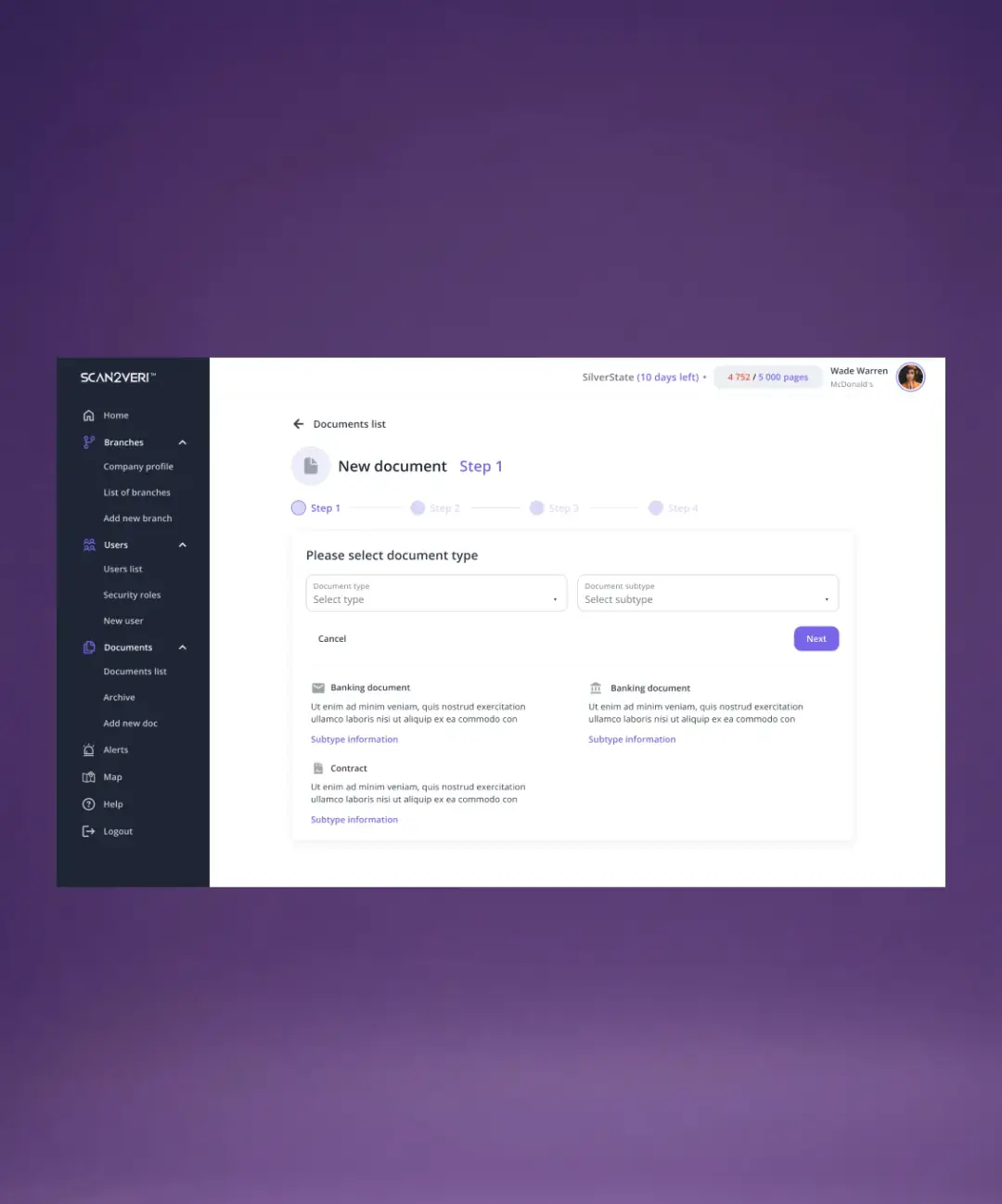
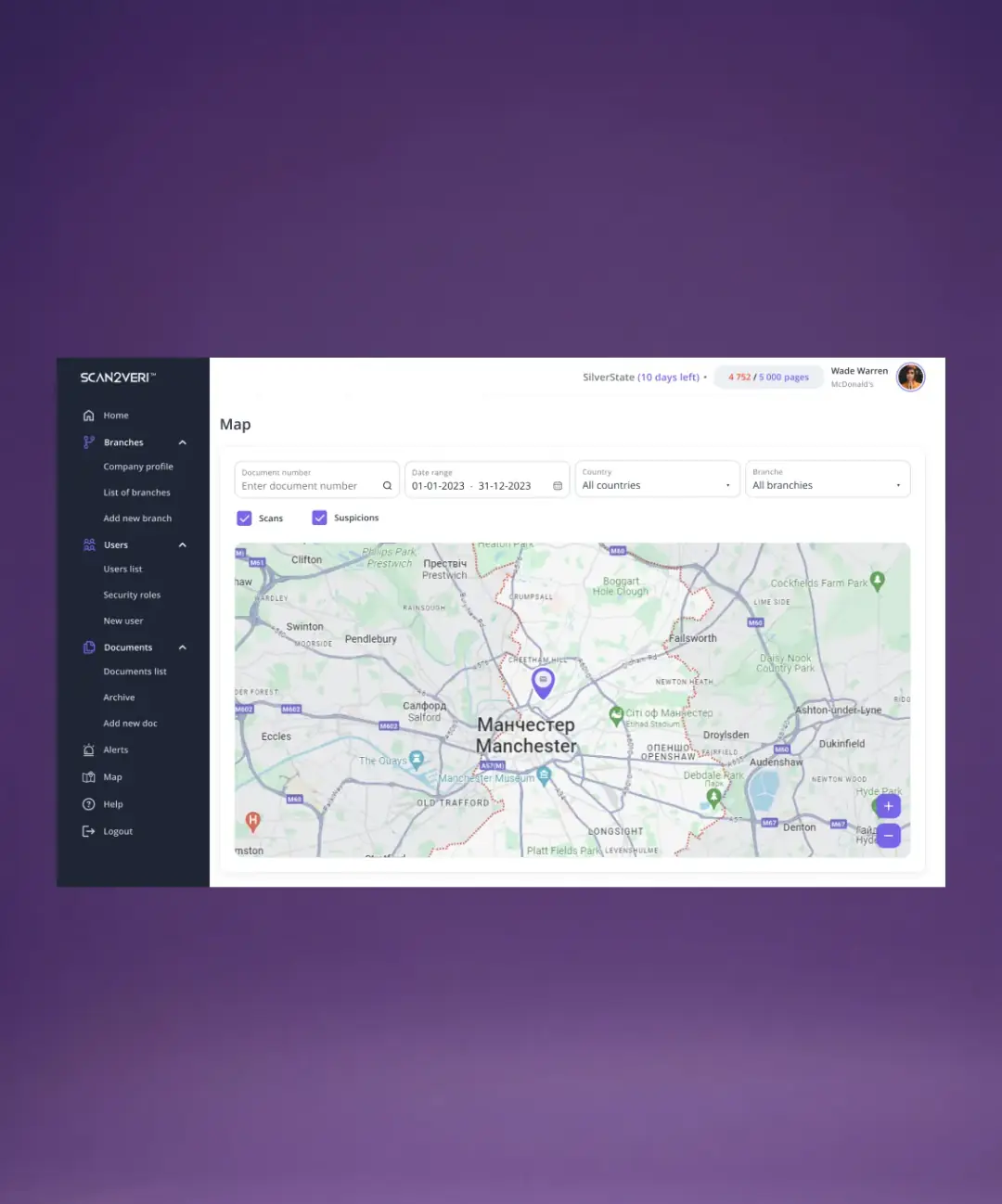
- Sidebar navigation organized by logical modules (Branches, Users, Documents, Alerts, Map)
- Expandable menu sections to reduce cognitive load while maintaining quick access
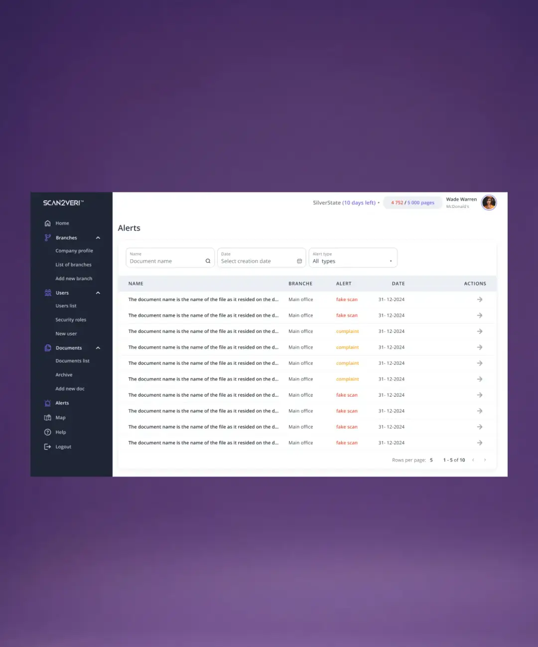
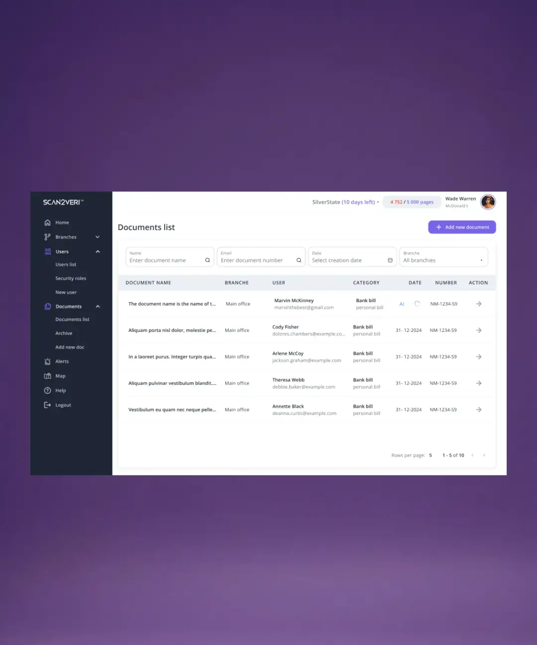
- Consistent data patterns across all modules (filters → table → actions)
- Multi-level drill-down from dashboard overview to detailed records
DESIGN SYSTEM FROM SCRATCH
THE PAIN
Starting from zero with no existing UI library, I needed to create a scalable design system that could support 50+ screens while maintaining consistency and speeding up development.
THE SOLUTION
I built a comprehensive design system from the ground up, tailored for enterprise SaaS complexity.
DASHBOARD & DATA OVERVIEW
THE PAIN
Administrators need an instant overview of the entire system — how many branches are active, document volume, user count — without clicking through multiple pages. Traditional dashboards either show too little data or overwhelm with charts.
THE SOLUTION
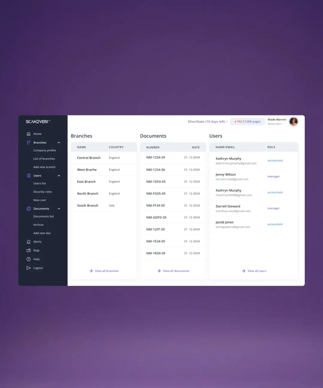
I designed a three-column dashboard providing at-a-glance visibility into the three core entities: Branches, Documents, and Users. Each column shows:
- Summary list of recent/top items
- Key identifiers (branch name + country, document number + date, user name + role)
- Quick actions ("View all" links) to drill down into detailed lists
- Top-bar status showing subscription tier ("SilverState"), days remaining, and page usage
USER MANAGEMENT SYSTEM
THE PAIN
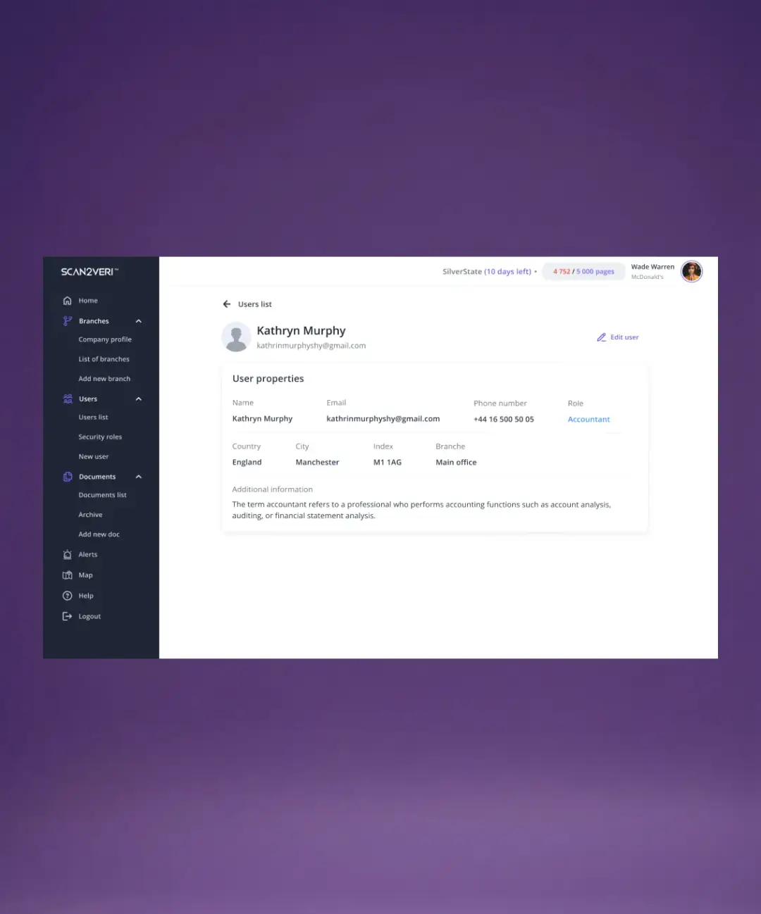
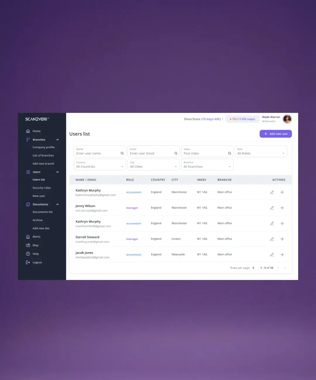
Managing hundreds of users across multiple branches and countries requires powerful filtering and clear data presentation. Admins need to quickly find users by name, email, role, location, or branch — and perform actions (edit, view details) without friction.
THE SOLUTION
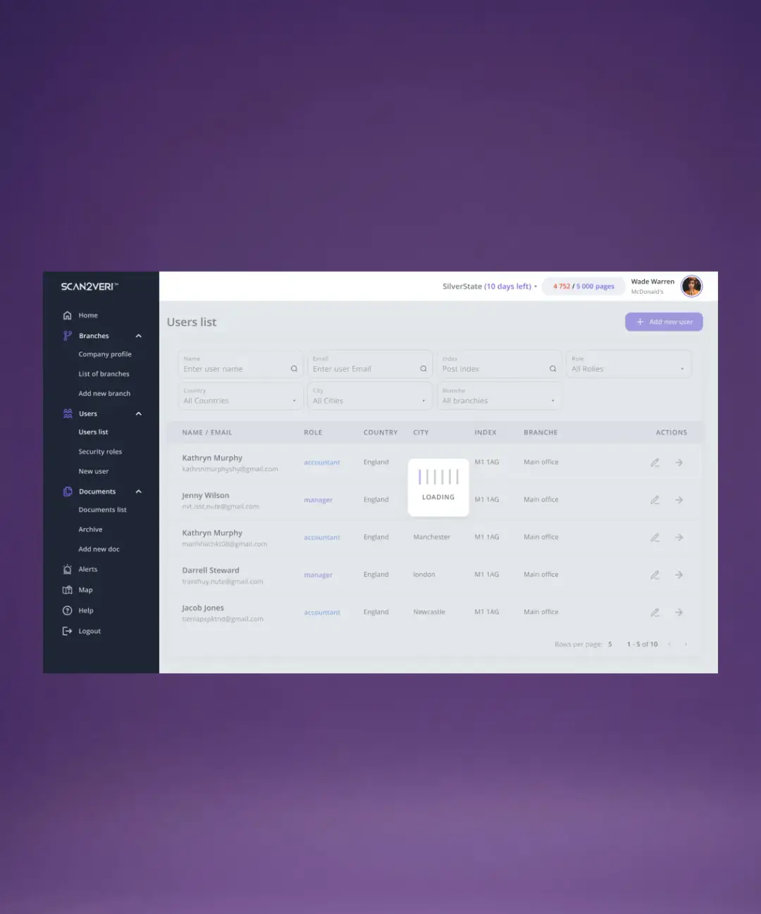
I designed a comprehensive user management interface with:
- Advanced filter bar (Name, Email, Index, Role, Country, City, Branch) allowing multi-criteria search
- Data-rich table showing Name/Email, Role, Country, City, Index, Branch, and Actions
- Inline actions (edit pencil, view arrow) for quick operations without opening new pages
- Pagination (5/10/20 rows per page) for managing large user bases
- "Add new user" CTA prominently placed for rapid onboarding
BRANCH MANAGEMENT
THE PAIN
Organizations operating across multiple countries need to manage branches hierarchically. Admins must filter by country/city, view branch details, and quickly add new locations as the business scales internationally.
THE SOLUTION
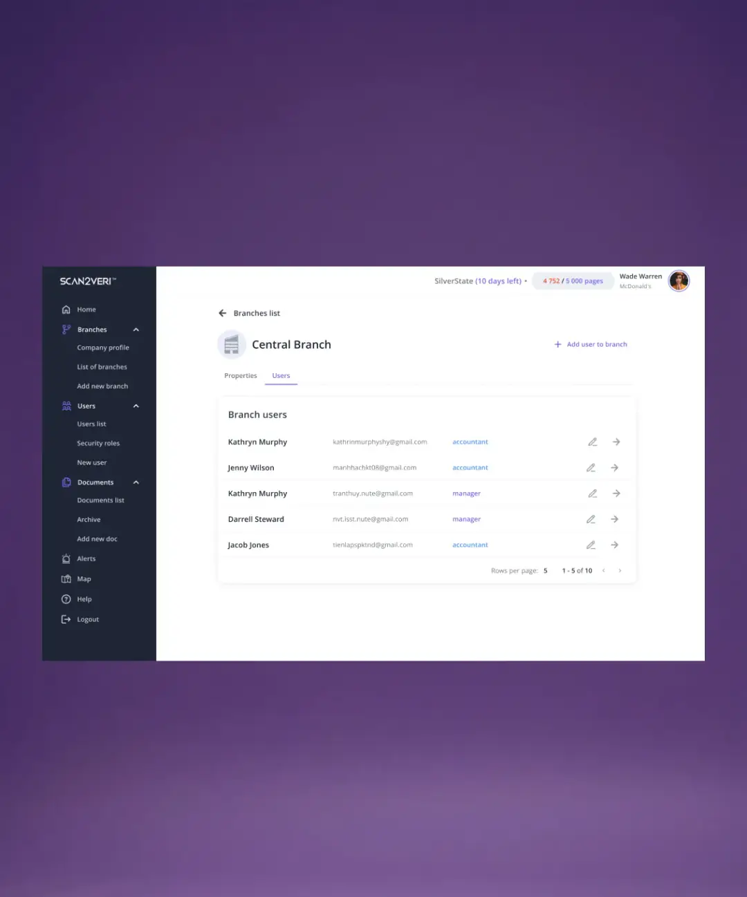
I designed a branch management module mirroring the user list pattern but focused on geographic data:
- Filter bar (Branch name, Country, City) for location-based searches
- Table columns: Name, Country, City, Actions
- Geographic diversity: Supporting branches in England, Italy, and beyond
- Consistent action pattern (edit, view) for familiarity across modules
MULTI-ROLE ACCESS CONTROL SYSTEM
THE PAIN
Different users need different permissions. Accountants shouldn't have the same access as system admins, and branch managers should only see their branch data. Without clear role visualization, confusion and security risks arise.
THE SOLUTION
I designed a role-based access control (RBAC) system with:
- Three distinct roles: Accountant (blue), Manager (purple), System Admin (full access)
- Visual role indicators throughout the interface (colored badges in tables)
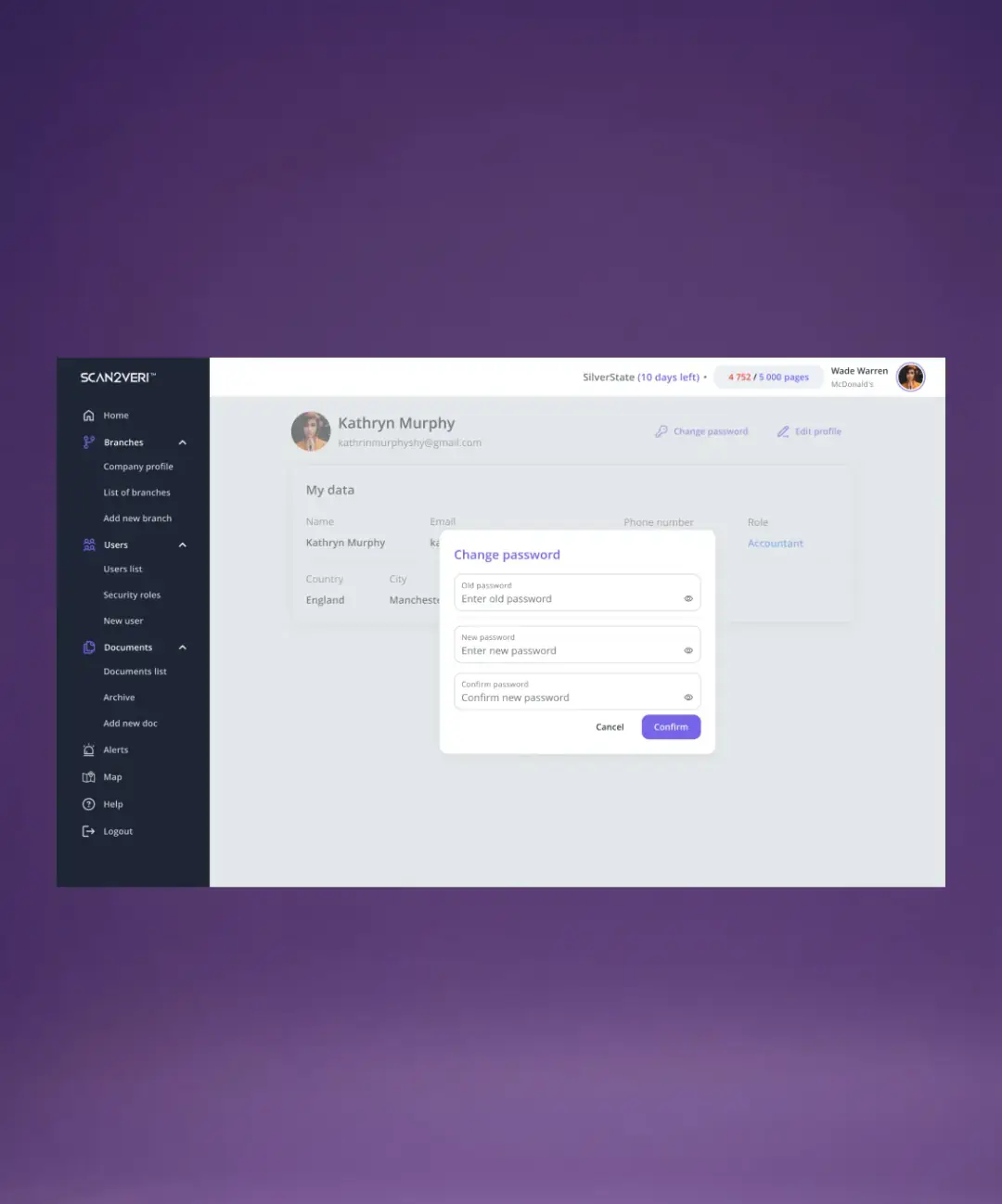
- Security roles management screen for admins to assign/modify permissions
- Contextual UI adaptation showing/hiding features based on user role
INTERNATIONAL & MULTI-COUNTRY ARCHITECTURE
THE PAIN
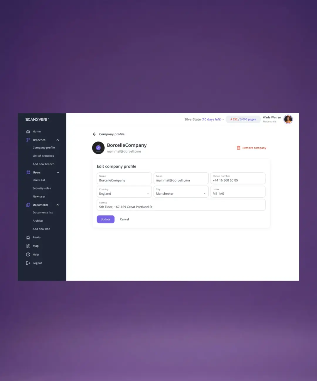
Scan2Veri operates across Great Britain, Spain, Cyprus, and Ukraine, with documents and branches spanning multiple jurisdictions. The interface needed to handle international data (different address formats, phone codes, document types) without confusion.
THE SOLUTION
I designed the system with internationalization in mind:
- Country fields in all relevant entities (Branches, Users, Documents)
- Geographic filtering allowing users to narrow by country/city
- Multi-country dashboard showing global distribution
- Office location cards with flags and contact info (visible on corporate site)
CORPORATE WEBSITE INTEGRATION
THE PAIN
Potential clients (enterprise, government, SaaS) need to understand Scan2Veri's value proposition before signing up. The corporate site must communicate complex blockchain technology in simple terms and showcase real-world use cases.
THE SOLUTION
I designed a corporate website (shown in first image) featuring:
- Hero section with blockchain visualization and tagline "All information is important"
- Solutions section with three pillars: Enterprise, Government, SAAS Documents
- Company timeline (2020–2024) showing evolution and milestones
- Geographic presence (4 countries with flags)
- Project portfolio showing implementations in different sectors (chemical industry, academic institutions, architectural control)
- Team section with employee cards
- News & FAQ sections for thought leadership and support
- Contact page with multi-country office information