
CONVX OPSAGE
CONVX IS A TECHNOLOGY PARTNER AND SYSTEMS INTEGRATOR FOUNDED IN 2018 WITH OFFICES IN DENVER AND ORLANDO (USA), SPECIALIZING IN SOFTWARE DEVELOPMENT, DATA ENGINEERING, AND CLOUD INFRASTRUCTURE. OPSAGE BY CONVX IS THEIR FLAGSHIP SAAS PLATFORM — A DATA INTEGRATION AND AI ANALYTICS SOLUTION FOR THE RESTAURANT, HOSPITALITY, AND RETAIL INDUSTRIES. I DESIGNED THE CORE DESIGN SYSTEM AND CRITICAL USER FLOWS (AUTHENTICATION, ONBOARDING, COMPANY MANAGEMENT, INTEGRATION SELECTION), ESTABLISHING PATTERNS AND RULES THAT ENABLED AI-ASSISTED SCALING OF THE REMAINING PLATFORM SCREENS.
THE CHALLENGE
THE PAIN
OpSage needed to serve restaurant owners and managers who are not tech-savvy but need powerful data integration capabilities. The platform had to:
- Simplify complex onboarding — restaurant owners need to set up their company, locations, and third-party integrations (Google Reviews, TripAdvisor, Yelp, Weather data) without technical knowledge
- Balance power with simplicity — the platform integrates multiple data sources and AI analytics, but the UI must feel approachable
- Establish a scalable design system — with AI assisting in generating remaining screens, the core design rules needed to be crystal clear and consistent
- Build trust through professional design — B2B restaurant tech requires credibility and polish
THE SOLUTION
I designed the core design system and critical user flows that address these challenges:
- Multi-step onboarding wizards (4–5 steps) with progress tracking
- Integration marketplace with filtering and recommendations
- Location management for multi-venue restaurant groups
- Split-screen authentication pages balancing branding and usability
- Design system that must work for both human designers and AI generation
DESIGN SYSTEM FOUNDATION
THE PAIN
With AI assisting in scaling the platform, the design system needed to be explicit, rule-based, and highly consistent — not just a collection of components, but a clear set of principles.
THE SOLUTION
I established a comprehensive design system with clear rules for colors, typography, spacing, components, and interaction patterns — a single source of truth for both human designers and AI-assisted screen generation.
AUTHENTICATION FLOWS
THE PAIN
Authentication pages are often boring and forgettable. For a B2B SaaS platform, the sign-in page is the first impression — it needs to communicate professionalism and brand identity.
THE SOLUTION
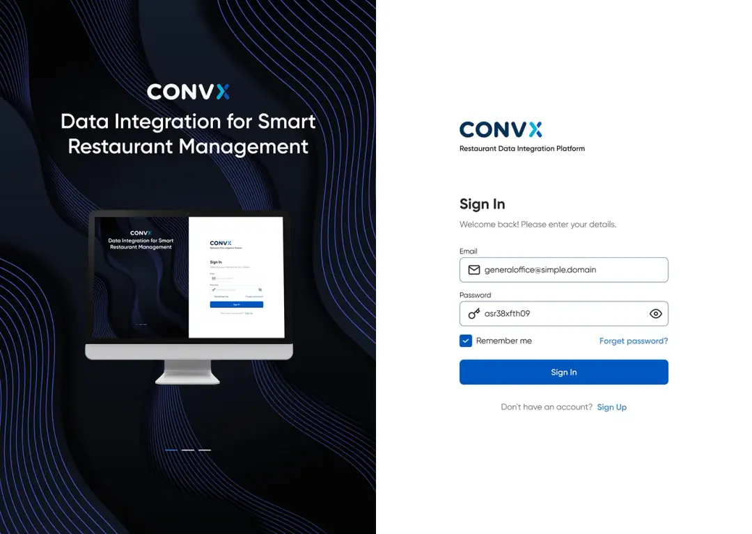
I designed a split-screen authentication layout that balances brand storytelling with functional clarity:
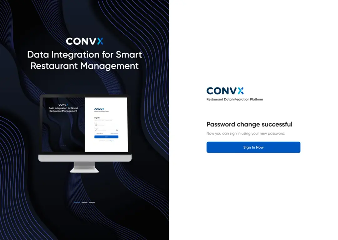
- Left Side (Branding): Dark navy background with flowing blue wave patterns, CONVX logo, headline "Data Integration for Smart Restaurant Management", and a monitor mockup showing the sign-in form (meta-visual reinforcement)
- Right Side (Function): Clean white background with CONVX logo, "Restaurant Data Integration Platform" subtitle, and the sign-in form
- Form Design: email field with envelope icon, password field with key icon and show/hide toggle, "Remember me" checkbox (blue checked state), "Forgot password?" link in blue, full-width blue "Sign In" button
- "Don't have an account? Sign Up" link at bottom
- Carousel Dots: three dots at bottom-left indicating multiple brand slides
SIGN UP
THE PAIN
New users need a frictionless path from "no account" to "working workspace". A confusing sign-up flow drops users before they experience the product's value.
THE SOLUTION
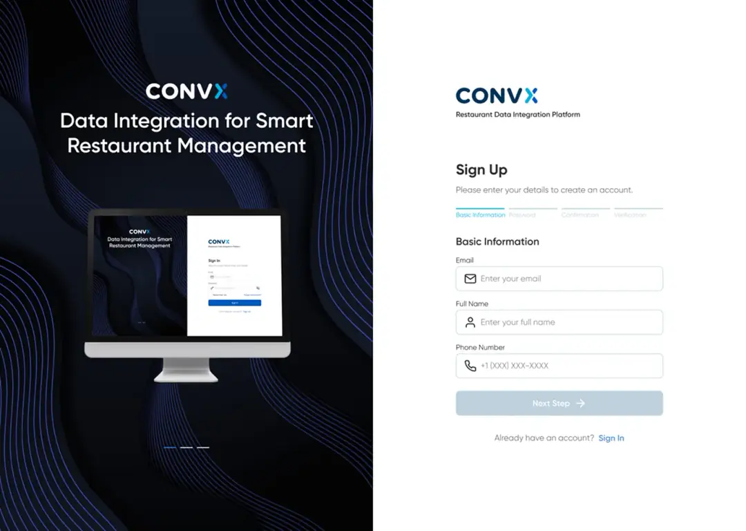
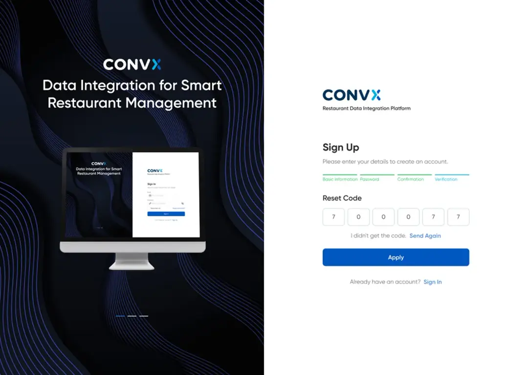
I designed a clean sign-up flow consistent with the sign-in experience:
- Same split-screen layout for brand continuity
- Minimal required fields: name, email, password with validation hints
- Clear password requirements displayed inline
- Terms of Service & Privacy Policy consent checkbox
- Seamless handoff into the company onboarding wizard after registration
FORGOT PASSWORD FLOW
THE PAIN
Users who forget passwords are often frustrated. The recovery flow needs to be simple, secure, and reassuring.
THE SOLUTION
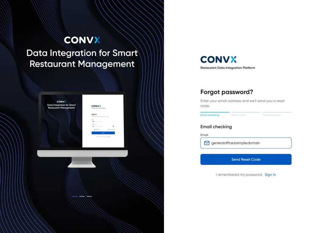
I designed a minimal password recovery flow with an email verification step, following the same visual language as Sign In / Sign Up:
- Single email input with clear instructions
- Success state confirming the reset link was sent
- "Back to Sign In" link for easy navigation
- Consistent split-screen branding for trust
COMPANY ONBOARDING (MODAL WIZARD)
THE PAIN
Restaurant owners need to set up their company profile with multiple locations and integrations. A long form would be overwhelming; a wizard approach guides them step-by-step.
THE SOLUTION
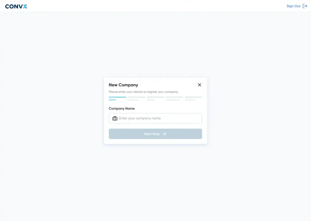
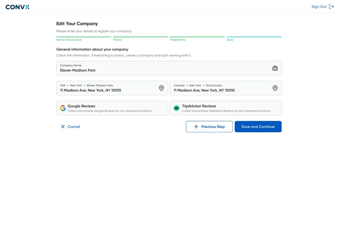
I designed a centered modal wizard with 5-step progress tracking:
- Progress Bar: Name → Location → Places → Integrations → Save (green = completed, blue = active, gray = pending)
- Header: "Edit Your Company" title with close (X) button
- Content Area: "General information about your company" section header, instructional text "Check the information. If everything is correct, create a company and start working with it.", Company Name field ("Eleven Madison Park") with briefcase icon, location cards (USA and Canada addresses) with map pin icons, integration preview cards (Google Reviews and TripAdvisor Reviews) with logos and descriptions
- Action Buttons: "← Previous Step" (outline) + "Continue" (blue filled)
- Modal Design: white card on light gray background with subtle shadow, rounded corners
NEW COMPANY — INTEGRATION SELECTION
THE PAIN
The platform offers multiple integrations (reviews, weather, historical data). Users need to understand what each does and select the right ones without feeling overwhelmed.
THE SOLUTION
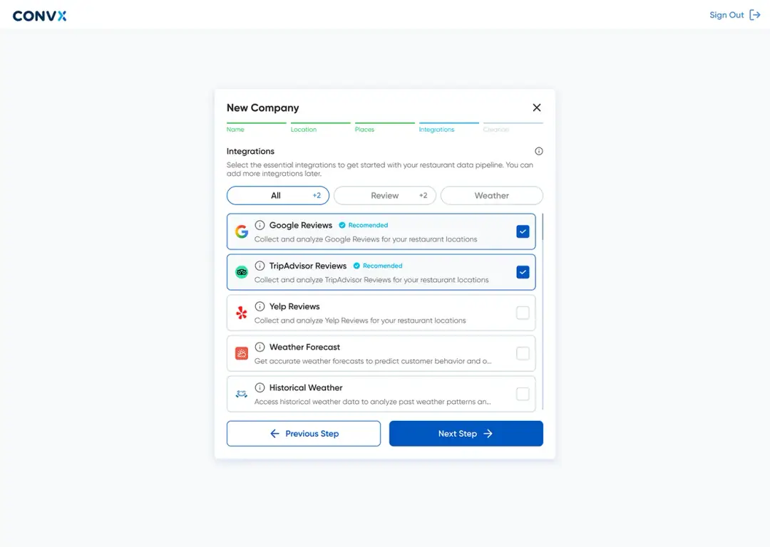
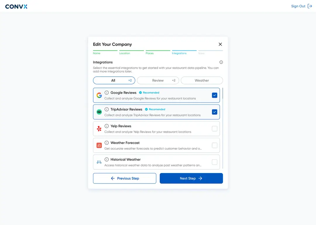
I designed an integration marketplace with category filtering and visual recommendations:
- Progress Bar: Name and Location → Places → Integrations (active, blue) → Creation (gray)
- Header: "Integrations" with info icon for help
- Instructional text: "Select the essential integrations to get started with your restaurant data pipeline. You can add more integrations later."
- Category Filters: 3 pill buttons — "All +2" (active, blue border), "Review +2", "Weather"
- Integration Cards (2-column grid): Google Reviews — Google logo, "Recommended" badge (cyan checkmark), description, blue checked checkbox; TripAdvisor Reviews — TripAdvisor logo, "Recommended" badge, description, blue checked checkbox; Yelp Reviews — Yelp logo, description, empty checkbox; Weather Forecast — weather icon, description, empty checkbox; Historical Weather — historical icon, description, empty checkbox
- Info Icons: each card has an (i) icon for detailed information
- Action Buttons: "← Previous Step" (outline) + "Next Step →" (blue filled)
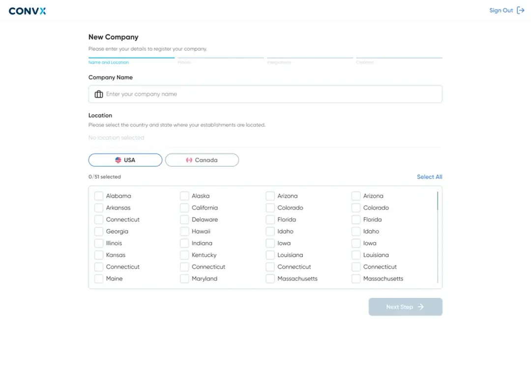
NEW COMPANY — PLACES SELECTION
THE PAIN
Restaurant groups often have multiple locations. Users need to select which locations to include in their account.
THE SOLUTION
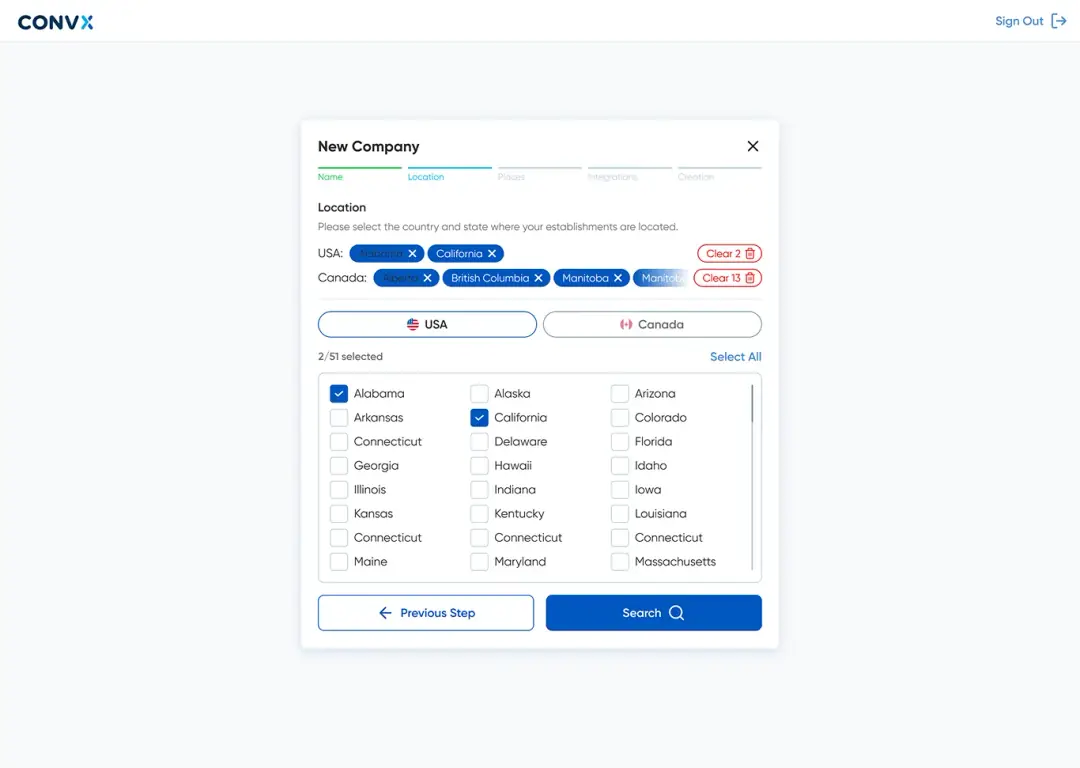
I designed a location selection interface with "Select All" and individual add/remove controls.
IN-APP COMPANY MANAGEMENT
THE PAIN
After onboarding, users need to edit their company information. The flow should be consistent with onboarding but accessible from the main app.
THE SOLUTION
Reused the same 5-step modal wizard pattern from onboarding, ensuring consistency and reducing the learning curve.
CREATE NEW COMPANY (MULTI-LOCATION SUPPORT)
THE PAIN
Restaurant owners may manage multiple brands or locations under one account.
THE SOLUTION
Designed a "Create New Company" flow that mirrors the onboarding wizard, allowing users to add additional companies to their account.
AI-ASSISTED SCALING STRATEGY
THE PAIN
With limited design resources, scaling the platform to 50+ screens would take months. AI could accelerate this, but only with clear design rules.
THE SOLUTION
I established explicit design rules and patterns that AI could follow to generate consistent screens:
- Documented Component Usage: when to use buttons, cards, modals, tables
- Layout Templates: standard page structures (header → content → actions)
- Spacing Rules: consistent margins and padding
- Color Usage Guidelines: primary for CTAs, secondary for accents, semantic colors for status
- Interaction Patterns: how forms, filters, and navigation should behave
- AI Prompt Templates: structured prompts for generating new screens following the design system