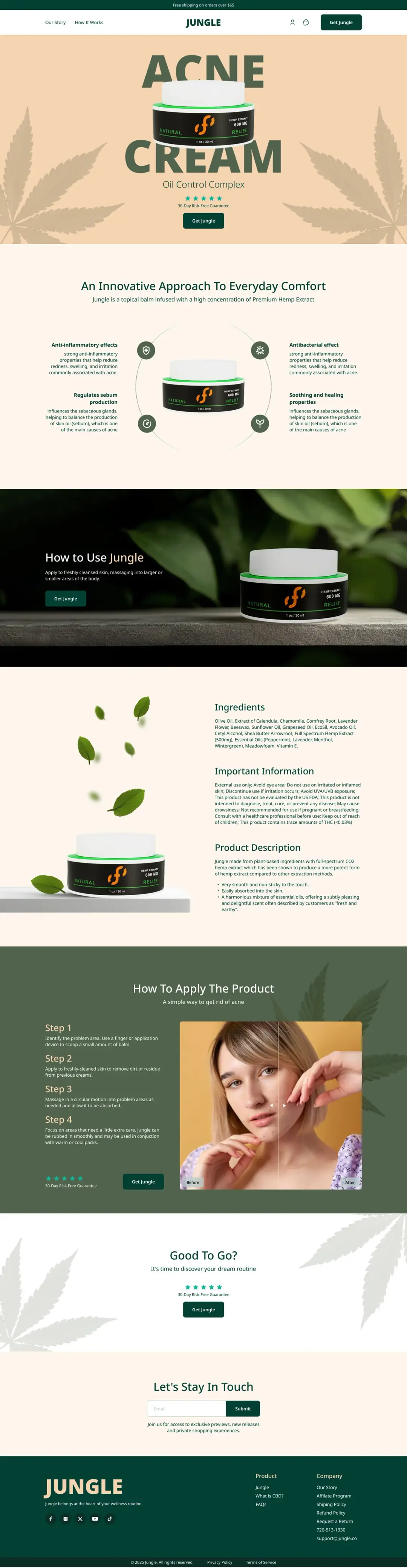
ACNE CREAM
JUNGLE IS A PREMIUM TOPICAL BALM INFUSED WITH HIGH-CONCENTRATION PREMIUM HEMP EXTRACT (600MG), SPECIFICALLY FORMULATED TO COMBAT ACNE THROUGH NATURAL, PLANT-BASED INGREDIENTS. I DESIGNED A HIGH-CONVERTING, FULLY RESPONSIVE LANDING PAGE THAT COMBINES BOTANICAL AESTHETICS, EDUCATIONAL CONTENT, AND TRUST-BUILDING ELEMENTS TO OVERCOME CONSUMER SKEPTICISM AROUND CBD SKINCARE AND DRIVE DIRECT PURCHASES IN THE COMPETITIVE US BEAUTY MARKET.
THE CHALLENGE
THE PAIN
The CBD skincare market faces a unique trust barrier: consumers are curious about hemp-based products but remain skeptical due to stigma, lack of education, and regulatory uncertainty. For an acne treatment specifically, users need:
- Clear proof that the product actually works (before/after evidence)
- Reassurance about safety and legality (THC content, FDA status)
- Understanding of how hemp helps with acne (not just "it's natural")
- A premium feel that justifies the price point over drugstore alternatives
THE SOLUTION
Position Jungle not as "just another CBD cream" but as a scientifically-grounded, nature-powered acne solution with transparent ingredients, clear usage instructions, and visible results.
DESIGN CONCEPT & VISUAL STRATEGY
THE PAIN
I crafted a visual language that bridges botanical authenticity with clinical credibility.
THE SOLUTION
- Color Palette: Deep forest green (trust, nature, hemp heritage) + warm beige/cream (skin, gentleness, organic) + black accents (premium, modern)
- Typography: Bold, editorial headlines for impact; clean sans-serif body for readability
- Imagery: Macro product photography on natural surfaces (stone, leaves) + authentic before/after human photos
- Motifs: Subtle hemp leaf patterns in backgrounds reinforcing brand identity without overwhelming content
HERO SECTION — INSTANT VALUE PROPOSITION
THE PAIN
Visitors have ~3 seconds to decide if this product is for them. Generic "natural skincare" messaging won't cut through the noise.
THE SOLUTION
I designed a bold, product-first hero that immediately communicates:
- What it is: "ACNE CREAM" in massive typography — no ambiguity
- What it does: "Oil Control Complex" — specific benefit
- Social proof: 5-star rating + "30-Day Risk-Free Guarantee" badge
- Clear CTA: "Get Jungle" button with free shipping threshold in top bar
BENEFITS WHEEL — EDUCATIONAL STORYTELLING
THE PAIN
Consumers don't understand how hemp helps with acne. Without education, they won't convert.
THE SOLUTION
I designed a circular "benefits wheel" that visually connects the product to its 4 core mechanisms:
- Anti-inflammatory effects — reduces redness, swelling, irritation
- Antibacterial effect — fights acne-causing bacteria
- Regulates sebum production — balances oil (root cause of acne)
- Soothing and healing properties — promotes skin recovery
HOW TO USE — LIFESTYLE INTEGRATION
THE PAIN
Users need to visualize the product in their daily routine, not just see it on a white background.
THE SOLUTION
I designed a cinematic "How to Use" section with dark, moody photography that positions Jungle as a premium self-care ritual, not a clinical treatment.
INGREDIENTS & TRANSPARENCY — TRUST BUILDING
THE PAIN
CBD skincare buyers are ingredient-conscious. They want full transparency about what's in the product and any potential risks.
THE SOLUTION
I designed a comprehensive transparency section with three clear subsections:
- Ingredients: Full list (Olive Oil, Calendula, Chamomile, Hemp Extract 500mg, Essential Oils, etc.)
- Important Information: Safety warnings, FDA disclaimer, THC content (0.03%)
- Product Description: CO2 extraction explanation, texture, scent profile
HOW TO APPLY — STEP-BY-STEP GUIDE WITH BEFORE/AFTER
THE PAIN
Acne sufferers need to see proof the product works and understand exactly how to use it for best results.
THE SOLUTION
I combined a clear 4-step application guide with an interactive before/after photo slider showing real results.
FINAL CTA — CONVERSION PUSH
THE PAIN
Users who scroll to the bottom are interested but need one final nudge to purchase.
THE SOLUTION
I designed a minimalist, high-impact closing section with friendly copy ("Good To Go? It's time to discover your dream routine") and repeated trust signals.
EMAIL CAPTURE & FOOTER — RETENTION & NAVIGATION
THE PAIN
Not all visitors are ready to buy today. Capturing emails builds a retargeting audience.
THE SOLUTION
I designed a clean email capture section ("Let's Stay In Touch") with value proposition ("exclusive previews, new releases, private shopping experiences") and a comprehensive footer with full navigation.