
DELEGAT
DELEGAT IS A CONCEPTUAL MOBILE APPLICATION DESIGNED TO TRANSFORM A TRADITIONAL UKRAINIAN MONTHLY MAGAZINE INTO A PREMIUM DIGITAL SUBSCRIPTION PLATFORM. THE APP DELIVERS EXCLUSIVE DIGITAL CONTENT BEYOND THE PRINT EDITION, CREATING ADDITIONAL VALUE FOR SUBSCRIBERS WHILE MODERNIZING THE BRAND'S PRESENCE IN THE DIGITAL AGE.
THE CHALLENGE
THE PAIN
Traditional print magazines face declining sales as readers shift to digital consumption. However, simply digitizing print content doesn't add value — readers need reasons to subscribe beyond what they can find for free online. Publishers struggle to:
- Create a digital experience that justifies a subscription price
- Offer exclusive content that drives digital subscriptions
- Maintain brand prestige while adapting to mobile-first consumption
- Balance editorial design aesthetics with mobile usability
THE SOLUTION
Rather than cannibalizing print sales, a well-designed digital subscription can complement the print edition by offering:
- More content than the print version (extended articles, bonus materials)
- Faster updates (breaking news between monthly issues)
- Interactive elements (video, audio, galleries)
- Personalized reading experience
DESIGN CONCEPT & STRATEGY
THE PAIN
I designed Delegat as a premium editorial experience that respects the magazine's journalistic heritage while embracing modern mobile UX patterns. The app positions itself not as a "digital PDF" but as an enhanced, living publication.
THE SOLUTION
- Editorial-First Design: Prioritized typography, whitespace, and visual hierarchy to maintain the feel of quality journalism
- Content Hierarchy: Created clear distinction between featured stories, daily updates, and archive content
- Subscription Value: Designed UI elements that constantly reinforce the value of digital-exclusive content
- Brand Continuity: Maintained the magazine's visual identity while adapting it for mobile interaction
DAILY NEWS FEED
THE PAIN
Monthly magazines can't compete with daily news apps for breaking stories. Readers need a reason to open the app between issues.
THE SOLUTION
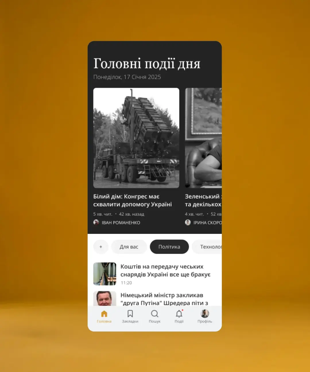
I designed a "Daily Highlights" section that provides curated news updates between monthly issues, keeping subscribers engaged daily while maintaining the magazine's editorial voice.
- Created a clean, card-based layout for daily stories with clear visual hierarchy
- Designed date-stamped headers ("Monday, January 17, 2025") for temporal context
- Implemented category tabs (For You, Politics, Technology) for personalized navigation
- Added reading time and publish time metadata for transparency
- Used high-quality photography with overlay text for immersive storytelling
ARTICLE READING EXPERIENCE
THE PAIN
Reading long-form journalism on mobile is often frustrating — tiny text, intrusive ads, and poor typography kill engagement.
THE SOLUTION
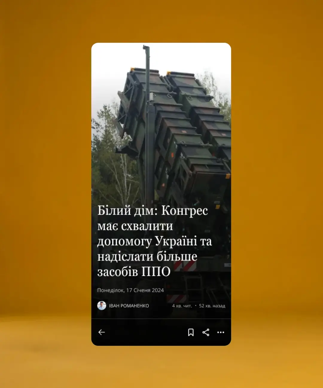
I designed an immersive, distraction-free reading experience optimized for long-form content with editorial-quality typography.
- Created a full-screen article view with large, readable typography
- Designed a clean header with article title, date, author, and reading time
- Implemented a minimal bottom navigation bar (back, bookmark, share, menu) to maximize reading space
- Used high-contrast black text on white background for optimal readability
- Added author attribution with avatar for credibility and personal connection
- Structured content with clear paragraph spacing and "Details" sections for deeper dives
SUBSCRIPTION VALUE PROPOSITION
THE PAIN
Why should readers pay for a digital subscription when they can find news for free?
THE SOLUTION
The app concept emphasizes exclusive value:
- More articles than the print edition
- Faster updates between monthly issues
- Digital-exclusive content (extended interviews, behind-the-scenes, multimedia)
- Archive access to past issues
- Ad-free experience (implied in premium positioning)
- Designed a sophisticated logo treatment maintaining brand heritage
- Created visual language that feels premium and trustworthy
- Positioned the app as an enhancement, not a replacement, of the print experience
CONTENT DISCOVERY & NAVIGATION
THE PAIN
Magazine readers want to browse by topic, save articles for later, and discover content aligned with their interests.
THE SOLUTION
I designed a comprehensive navigation system balancing discovery, personalization, and utility.
- Created a 5-tab bottom navigation: Home, Bookmarks, Search, Events, Profile
- Implemented category filtering for personalized content discovery
- Designed bookmark functionality for saving articles to read later
- Added search with filters for archive exploration
- Created user profile section for subscription management and preferences
CONCEPT LIMITATIONS & LEARNINGS
STATUS
This project remains a concept due to lack of client funding for full implementation.
WHAT I LEARNED
- Designing for editorial content requires deep respect for typography and reading experience
- Subscription models need constant value reinforcement throughout the UX
- Balancing daily news with monthly magazine content creates unique information architecture challenges
- Concept projects allow creative freedom but require extra effort to communicate real-world applicability